Okay, let's start from the beginning. Since quite some time we have been asked to provide graphic material that fits nicely together - you may remember our earlier effort concerning the LibreOffice Branding Guidelines.
Sure, the branding guidelines tell you in detail what to do (and to avoid) with regard to our logo, the fonts, ... but a recurring element was still missing. Until now, we used the "triangle pattern" you see in the LibreOffice splashscreen, for example.
Nik took the initiative and started the "LibreOffice Motif Design Task" ... so I'm mostly quoting or referring in this blog posting to other people's work. He explained what a motif generally means:
For our purposes (it has other industry-specific meanings) a motif is a Design element that is used to bring consistency to a range of Design artifacts and sets a "mood" or "atmosphere" visually without taking up too much attention. It is a support element and should compliment the contents of every Design. As such, it usually takes the form of a background-image/vector.
If it wants to set the "mood", it's not an easy task - because it has to fit to the community and the product. So we had exciting days (although things never go as quick as you like, of course) of creating proposals, discussing them, and rating them.
To make a long story short(er), we had:
- 12 proposals by 5 people
- 14 votes
- And a clear winner: Scatter by Nik (10 votes)
Here is the basic design, which is based on the document symbol "triangle":
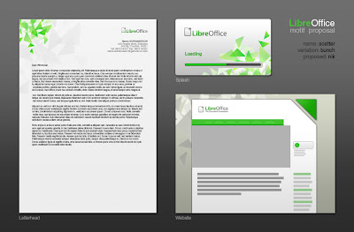
To prove that it'll be working, Nik provided the Scatter motif in context - although the green is a bit different, you'll get the idea:
To me, this design is a perfect example for our community. It reminds me of the diversity of the different people (different orientation, slightly different color of the triangles) while trying to archive something great together (group of triangles). By the way, Nik told me that he put a lot of effort into making something "organic".
Fine, and now? For example, Drew started to refine a postcard which had been made by Nik as an example. Here is the front:
Want to see more? Have a look at the Existing Designs Wiki Page and find out that even a professional publisher picked the motif (Thanks to them!).
Finally, thanks to all the guys who participated in creating and supporting such the fine motif design piece ... My deepest thanks go to Nik, who took care about documentation and guidance. If you want to see more, e.g. all the motif proposals, then go to the Design Motif Wiki Page.
I'm looking forward to see how our project will get "motifated". Website, LibreOffice product artwork, marketing material, ...
Cheers,
Christoph


3 Kommentare:
Scatter? To me it says chaos, hail-storm, sharp-edges, you're under attack. The other proposals must have been really terrible, then.
Be fair. It's not seagulls.
Those of us who live on the coast and have to wash our cars 3 or 4 times a day have long referred to Seagulls as Shitehawks.
Awesome! I like this new design!
Kommentar veröffentlichen