Samstag, 22. Oktober 2011

LibreOffice Conference 2011, Personal Summary

Well, seeing all the nice reports from the LibreOffice Conference, let's add another one ...

General

First and foremost, it has been great fun to see all the people (again) - I really missed to be with them. And, thanks a lot to the organizers and the presenters who made up our first conference that great! Finally, kudos to all people who drive LibreOffice and make it the best free (as in speech) office suite out there.

Visual Design

I really loved to see all the nice graphics that have been created by (or at least originated from) the Design Team. For example, I was really pleased to see that almost everyone used the official conference presentation template and it seemed (despite a few glitches) to work quite well.

And, Nik's Paris Conference logo could be seen everywhere at the venue. And, I think that the conference team turned that into the most stylish bags we've ever had ...

The LibreOffice Conference Bag


Moreover, you may have noticed the work on LibreOffice Online - a browser accessible version of LibreOffice. To support the initial announcement (being meant as some kind of surprise), I have been asked in advance to provide a preliminary logo for it. Of course, my proposals and the sources have been made available in the meantime.


User Experience and Usability

Before the conference I was a bit unsure how to address topics like usability when talking to developers. Now I know that there was no need to worry, because so many developers I've talked with seriously want to improve LibreOffice. Some examples:
  • In his presentation, Cédric mentioned the good feedback on the libreoffice-ux-advise list when he worked on the special indicators in Writer (header / footer indicators, page break indicators). Vice versa, Cédric, thanks for being so open to our proposals.
  • Markus from the Calc team offered to fix some UX issues within the next releases, if we provide some hints what really needs to be improved. Awesome!
  • Kendy did the talk "Polish LibreOffice Rough Edges" where he asked the auditorium for paper cuts (tiny issues). He'll turn them into Easy Hacks :-) (For the curious, I've proposed Navigator improvements related to issue 36309, correcting the Edit - Selection Mode menu, the Help - Credits, Zooming behavior.)
  • Thorsten asked for further LibreOffice usability issues and Lior was so kind to support to collect them ... at the conference, we already had a discussion where to find relevant user feedback. Furthermore, he joined the LibreOffice design team mailing lists to support us with regard to CTL questions. Thanks a lot!!!
  • After talking about the Design Team, Christophe Strobbe asked how accessibility is considered ... I proposed him to join the Design Team as well. In the past, I really appreciated a helping hand for accessibility when designing features.
  • Finally, some people at the conference talked about Usage Tracking and how it could be (re-)implemented. In the long run, we really need such usage data ... thus, I'm happy that other people care about that as well.
Design Team Stuff

There have been some nice presentations that directly relate to Design Team activities, so here is a brief overview:
  • Björn Balasz (Detecting signals in the feedback noise), talked e.g. about the needs of the development when it comes to UX issues. He talked about the importance of both quick and high quality feedback - which led to the question, whether parts of the UX work should be professionalized in the long run. To me, this also leads to the question how we can get more efficient / effective in the Design Team, to get more people involved ...
  • André Schnabel and myself (Developer tasks for non code hackers), covered the importance of non-code contributions ... and how to start. Have a look at the presentation (Direct Link PDF, and more info)!
  • Lionel Dricot (What is usability and what does it mean for us?) highlighted the importance of usability in general ... after the talk we've met and I gave some insights about the Design Team and our UX work in the former OOo days. Due to his experience, I really hope that his time permits supporting us ... would be cool! 
Björn Balasz


Lionel Dricot

LibreOffice - The Software

Talking about usability usually leads to the question: What is our overall goal for users? Thus, Björn Balasz, Lionel Dricot, David Rajchenbach-Teller (Mozilla), Andreas Mantke and myself sat together and tried to formulate a vision for LibreOffice.

Well, we tried for 1,5 hours, but it was (and is) really hard to identify a unique selling point that works for "normal users". Although, we do have an excellent free software productivity suite and we're supporting open standards ... Joe Average doesn't care about that.

Consequence: Open question, discussion to be held on our mailing lists :-)


LibreOffice - The Project

At the first day of the conference, there has been a SC meeting where we also discussed how teams currently collaborate. We noticed that there is some confusion what the teams to and how everything (should) work together ... so it was proposed to provide an overview that gives a rough overview over the community. Moreover, the teams (here: including the Design Team) are asked to provide some documentation (maybe on their wiki page) summarizing how they work and what they do. Any volunteers for that? :-)

The End

Well, thanks for reading this summary. I hope you found it insightful ...

Cheers,
Christoph

Donnerstag, 15. September 2011

Personal Hackfest 2011 Summary


Almost two weeks ago, we had our LibreOffice Hackfest in Munich. It's time for a personal summary what happened there, because my involvement was rather providing functional design improvements than committing patches (besides the logo).

But before I start, I want to say thank you to all those who helped to make that a unique event (e.g. the organizers, the City of Munich, the Café Netzwerk people) ... to all the friends I haven't seen such a long time ... and to Italo who prepared excellent pasta.


Now some of the stuff we've worked on ...

Header / Footer Handling (Writer)

Some of you may have noticed the headers/footers handling work by Cédric. The original issues were:
  • Users often selected page background pictures (think watermark) instead of text. Usually, such background pictures are anchored in the header/footer of a page.
  • User sometimes change the header/footer content on one page without knowing that this will have impact on other pages.
There are more issues that got resolved, but you're prolly interested how the solution looks like at the moment. Here is a "brushed up" screenshot of what Cédric is working on:


I don't want to reveal more ... due to time constraints I was unable to add a Whiteboard for the discussions. So either test a daily build, wait for another blog post, or dive into the extensive discussion at libreoffice-ux-advise.

Page Range Improvements (Calc)

Calc already features advanced "named ranges" (or "named expressions", as the developers prefer to say) since LibreOffice 3.4. But, a reasonable user interface to manage these ranges is still missing.

Markus was so kind to spend quite some time to discuss this issue - and he is already working on bringing that into LibreOffice. Although we need to resolve some open (one even fundamental) question, you may get all the updates on the: Calc Range Names Whiteboard page.

A (still in work) teaser:

This proposal is currently in review by Kohei, Eike, Markus ... thanks to you guys!

Improving the Extension Installation Experience

One of the very first contributions within this community was to review a specification of the "Extension Manager" some years ago ... already from a User Experience perspective. The more I was happy that Christian, one of the developers, proposed to work on "proper error reporting for erroneous OXT/ extension folder (missing files, missing keys, more specific and understandable errors)".
In the very first step, he thought about providing detailed insights why installing an extension might fail - which helps developers to debug extensions. But then we've discussed some ideas how to make such error messages also more helpful for less experienced users. For example, having easy-to-understand texts, having clues who developed the extension, how to provide feedback if the installation went wrong, ...
I'm curious with what he will come up with ;-)

Reworking the Options

The initial question from Regina and Reinhard was "How can we improve the understandability between document only vs. LibO settings?" A tough question, because I once tried to answer that question in the activity Improved Options in OOo times.

After some further discussion (and more ideas what should be improved) we came to the conclusion that it is required to to collect the information of all the available options first - from technical details to number of use. Currently, we try to figure out how to do that ... I hope that Astron (who started a similar activity some weeks ago) and others will join.

And there was much more ... for example the "how to better interact with the developers". That's something for another post, so let's take some breath now.

A more complete list of achievements by all participants is available in the wiki.

Cheers,
Christoph

Samstag, 13. August 2011

Sliced Visual Design Time

Hi everyone,

the first blog posting since weeks ... although I'm still fascinated to experience the first time with our child, I'm still (at least mentally) with LibreOffice. Some vacation from my day job helped me to spend a bit more "LibO time" (which is currently hard to predict). Since we travelled a lot, visual design stuff was something easy to work on "in slices".

New Banners for the Website 

Currently, our different websites (e.g. the conference website, the donation website) are only losely coupled. For a quick-fix, banners had to be added to the  LibreOffice front page ... unfortunately, nobody within the Design Team was able to spend some time on that. Instead, David was so kind to develop a first version.

These banners got replaced by new ones following more closely our branding language (and using Nik's and Paulo's artwork). Now, our website looks like that ...


If anybody wants to pick that up, for example to derive default web banners, or to translate the text - the source SVG file is here.


Conference Presentation Template

Some weeks ago, Charles asked for a presentation template for the upcoming LibreOffice conference in Paris (side note: don't forget to register...). Since I was always unhappy about the conference templates we had for the OOoCons, I decided to give it a try ...


The template proposal implements what I've usually missed, e.g.:
  • providing much space for the content (which is more important than any logo)
  • proper use of master pages incl. footer area definitions: first slide, default slide, section header slide, last slide
  • pre-defined shapes / graphic object styles / gradients for the presentation authors
  • correct language settings (spellchecking should work for English)
  • font fallback definitions if some are missing on the target system
  • small size for those who want to download the final presentations afterwards (having no broadband access)
  • taking care of our LibreOffice branding language
So, let's see what template proposal will be picked :-) If you want to have a closer look, here is the template proposal.

Stuff for the Hackfest in Munich 2011

Most of you have (should have) heard about the Hackfest in Munich, 2011. Florian asked for a logo ... so I initially drafted some fun motto:


Curious? Maybe this and that makes it more understandable...

However, others joined with proposals. After some mixing and matching, I came up with a combination of the conference logo text and our macro icon (LibO initial icon design). I hope the devs don't mind the gearwheel ...


Well, a logo doesn't help much. So I've added some information panels / sheets that can easily be printed (A4). There are versions without content (for on-site labeling), explanation text, different directions and the motto text. Here is an example:


Of course, source files are available - so feel free to use them for your meeting.

Final Words

Since I talked about "LibO time is less predictable", I owe Caolan, Cedric, Bjoern, Josh, Rainer, Nik, Drew, Andreas, Bjoern (another one) and many others a big thank your for their patience. Please, if something is urgent or I did miss to reply - then please feel free to send a reminder.

I really hope to continue with some user experience / usability related stuff ... some issues and other requests are still waiting.

Enjoy your day,
Christoph

Freitag, 1. Juli 2011

Improved Download Page Proposal

Hi everyone,

the last time I blogged about the parental leave ... still enjoying that time. But, sometimes I'd like to continue supporting LibreOffice and among different stuff in the last weeks (e.g. in the issues, or the libreoffice-ux-advice mailing list), I had a look at the Download section of our main website.

The Issue
It has been reported several times that end-users are unaware concerning the release scheme of LibreOffice and may experience problems with X.X.0 releases. Converning the latter, this is also a problem of users who download the software on external pages unrelated to TDF - the corresponding warning/information might be missing.

Furthermore, there have been complaints that the TDF LibreOffice Download page is too complex for normal users. Consequently, the LibreOffice Download Experience has to be improved.

Here is the download page how it looks today:


Although everything works, it seems a bit crowded, very complex and sometimes even misleading (as reported by users).

The Proposed Solution
Since everybody likes pictures, here is are just two mockups.

First, a mockup that demonstrates how the initial website will look like for a Microsoft Windows user.


Second, a mockup that demonstrates the website for a user who decided to go for the "Latest Features" version using a Linux based operating system. Moreover, the user already expanded the Download Options area.


You know, mockups miss a lot of information ... so don't forget to read the Download Page Whiteboard page telling you all the details ... please read that page before raising any concern ;-)


Thanks!

A "thank you" to all who helped to shape these proposals ... the earlier discussions on different mailing lists helped a lot (especially Nik who provided great thoughts). Furthermore, I'd like to thank Christian who helped to collect some of the requirements for a revised page design.


Personally, I hope you like the propsal. I'll announce it at the website mailing list, so join the discussion - or much better: help with the implementation.

Cheers,
Christoph

Donnerstag, 5. Mai 2011

Status of the Design Team Kick-Off, and a Personal Note

Status of the Design Team Kick-Off

You might remember our earlier blog postings concerning the Design Team Kick-Off, an effort to get to know each other and to build a sufficient structure that helps us to make LibreOffice a great software ...

So, we brainstormed a bit what we'll need ... not in terms of work items (improve this or that in the user interface, add missing icons etc.), but in terms of organizational stuff (how to make decisions, how to get data about our users etc.) Although it took a while (my fault due to parallel issues), we have now a comprehensive list of what's missing at the moment ... on the What We Need page.

We don't know each of the solutions yet, but sometimes it is more important to know what to work on, than to work on anything without knowing what for ... so I hope that the Design Team continues to work on that. Until know, it was great to see all the good brainstorming.

If your team has some ideas what might be needed to cooperate, then feel free to add it to the team sections on the same page. Björn and Thorsten have been so kind to look at it from a developers point-of-view: Thanks a lot guys!


Oh, and since I've noticed a few discussions in the last days concerning "user interface design", please have a look at my temporary working space in the wiki. I've listed some of the Interaction Guidelines for the platforms we support - of course, it is just about UI elements, but it should already help to keep the focus in discussions. If you like, please move the content to a page where it makes a bit more sense (e.g. Design/Guidelines). At the moment, I really miss the time ... but why?

Personal Note

As some of you already know, our son was born yesterday :-) And that's the explanation for having been less active (especially) during the last three weeks ... and the reason for being absent for some more. I'd like to enjoy this time without working on LibreOffice.

Why? The last years, I dedicated a lot of time to StarOffice / OpenOffice.org / LibreOffice ... user support, interaction design stuff, being the OOo User Experience Co-Lead, serving in the OpenOffice.org Community Council, and helping to shape the TDF (long before LibreOffice went public). I think its fair to - this time - spend a bit more time with the family.

I'll be back soon :-)

Cheers,
Christoph

Freitag, 22. April 2011

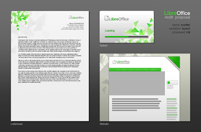
LibreOffice gets a Motif

LibreOffice gets a Motif ... a what?

Okay, let's start from the beginning. Since quite some time we have been asked to provide graphic material that fits nicely together - you may remember our earlier effort concerning the LibreOffice Branding Guidelines.

Sure, the branding guidelines tell you in detail what to do (and to avoid) with regard to our logo, the fonts, ... but a recurring element was still missing. Until now, we used the "triangle pattern" you see in the LibreOffice splashscreen, for example.

Nik took the initiative and started the "LibreOffice Motif Design Task" ... so I'm mostly quoting or referring in this blog posting to other people's work. He explained what a motif generally means:

For our purposes (it has other industry-specific meanings) a motif is a Design element that is used to bring consistency to a range of Design artifacts and sets a "mood" or "atmosphere" visually without taking up too much attention. It is a support element and should compliment the contents of every Design. As such, it usually takes the form of a background-image/vector.

If it wants to set the "mood", it's not an easy task - because it has to fit to the community and the product. So we had exciting days (although things never go as quick as you like, of course) of creating proposals, discussing them, and rating them.

To make a long story short(er), we had:
  • 12 proposals by 5 people
  • 14 votes
  • And a clear winner: Scatter by Nik (10 votes)

Here is the basic design, which is based on the document symbol "triangle":


To prove that it'll be working, Nik provided the Scatter motif in context - although the green is a bit different, you'll get the idea:


To me, this design is a perfect example for our community. It reminds me of the diversity of the different people (different orientation, slightly different color of the triangles) while trying to archive something great together (group of triangles). By the way, Nik told me that he put a lot of effort into making something "organic".


Fine, and now? For example, Drew started to refine a postcard which had been made by Nik as an example. Here is the front:


Want to see more? Have a look at the Existing Designs Wiki Page and find out that even a professional publisher picked the motif (Thanks to them!).


Finally, thanks to all the guys who participated in creating and supporting such the fine motif design piece ... My deepest thanks go to Nik, who took care about documentation and guidance. If you want to see more, e.g. all the motif proposals, then go to the Design Motif Wiki Page.

I'm looking forward to see how our project will get "motifated". Website, LibreOffice product artwork, marketing material, ...

Cheers,
Christoph

Montag, 4. April 2011

No Light Without Shadow

Hi all!

A German saying tells us "Wo Licht ist, ist auch Schatten" - this may be translated with "No Light Without Shadow". Well, since I perceive a lot of light with regard to the amazing progress of LibreOffice, there needs to be shadow as well.

Some of you might have noticed some "document border" discussion weeks ago. Sébastien already implemented a much friendlier document shadow for Writer (see here) on the basis of Andrew's idea in bug (or better: Easy Hack) 31251.

Since there had been some intensive discussions, I finally spend some time on this topic and wrote my first (more or less) serious specification for all the LibreOffice applications: Document Background

In short, here is the outcome if an improved document outline, a slightly revised shadow, and a gradient get combined ...


Sébastien replied that he'll working on an improved Draw/Impress shadow at the moment. I'm curious whether we can beautify and harmonize all components of LibreOffice. So far, a big thank you to Sébastien!

Back to the "Light / Shadow" topic. What if we add some more decoration - maybe some some Document Triangles ...


Where do these triangles come from? Something to blog about later ... maybe another Design Team guy will talk about it.

That's it so far ...

Cheers,
Christoph

Samstag, 5. März 2011

Idea: LibreOffice Mail Attachment Service


During the time with OpenOffice.org, it was quite common to come up with some ideas from time to time. But during the amazing first months with LibreOffice, I simply lacked the time ... until now. So here is the very first idea that is aimed to improve the handling of mail attachments on the mailing lists.

Summary

Enable sending attachments to mailing lists and keep in mind: security, traffic, ease-of-use, costs and misuse potential.

Solution Proposal

If a mail from a subscribed person is sent to a mailing list, and this mail contains an attachment, then the attached file gets extracted from the email and saved on a server. Then, the system embeds a link to this file (or a website containing this file). After this, the mail gets delivered as usual to the mailing lists and the mail archives.

Here is a draft how this may look like for the mailing list members, once they get a mail that originally contained an attachment:


And now?

If you want to know more, please have a look at the full proposal at the dedicated wiki page. There, you can find some user stories, a more detailed technical description, and a extensive FAQ concerning this idea. Go, go, go :-)

Cheers,
Christoph

Samstag, 19. Februar 2011

Design Team Kick-Off Step 3: We are the Design Team

Hi all,

a while ago I summarized the Design Team's current status of work - now I'd like to talk about the members of the Design Team. Who are they, what are they interested in, and how do they look like? Here we go ...


To get to know each other, we've asked everybody for some insights like "What are you interested in?", and compiled the Design Team member list. On this list, you'll also find some links to user pages with even more stuff you ever wanted to know (or maybe not).

What I can say is, that I'm pretty amazed who we are ...
  • Some members have a professional usability and/or user experience background
  • Highly skilled artists are with us - also with professional background
  • There are new faces with lots of fresh ideas, and also long-term community members
Not to forget the "lurkers" who are subscribed to our mailing list. Some of them mentioned they want to follow our work first ... of course! I consider them more than important, since I hope they'll help us to keep some connection across the mailing lists (e.g. mentioning not to be missed topics on the development mailing list, or on the local mailing lists). By the way, the number of subscribed users is 106 (2011-02-07)

If you want to know more, see Kick-Off Wiki Page: Introducing the Team Members.

Well, it seems we are getting ready for some serious work ... :-)

Cheers,
Christoph

Montag, 7. Februar 2011

FOSDEM 2011 - summary

Hello world,

as others already pointed out, the FOSDEM was a great experience ... especially since I've enjoyed to see most of the TDF guys. So here some more pictures, and finally the link to my talk.

Experience

We had interesting talks, maybe because it was simple to identify the "green people"?


The developers prepared some USB storage with the complete source code, so that the people hanging around could jump-start to develop LibreOffice. But - apart from the interesting hacks - why should they do that?


As we did some awesome marketing (tm) before, here is another one: "Clothing for Code". So, if people completed an Easy Hack during (!) the FOSDEM, then they got one of those green hoodies.

If we continue with that initiative, we have some more proposals how to call that - summary:
  • Hack for a Hoody
  • Fashion for a Fix
  • Clothing for Code

Rather late, I noticed that I lacked a picture of our devroom ... here is the very last presentation.


Please note, that another awesome marketing tried to support Kendy to get some of the money he privately invested to bring the clothes. It seems that it worked ... he can now go home. Safely :-)


Presentation
I've added my presentation "Kicking off the LibreOffice Design Team to the freshly created Design Team presentations wiki page. So if you want to have a look at it - here are the links: ODP, PDF. A video might be available soon.

Looking forward ... so many trade fairs and conferences to go :-)

Cheers,
Christoph

Samstag, 5. Februar 2011

FOSDEM 2011 - first bits and pieces

Hi guys,

so here are some first impressions from the FOSDEM 2011.

The yesterday's FOSDEM Beerevent ... awesomely crowded, here you side a picture outside the café.


The first "real" day starts with an almost empty booth ...


... so get all the little gadgets ready ...


... unpack the freshly made "Freedom Never Tasted So Suite" shirts ...


... do some awesome marketing ...


... start talking to people to make them aware of LibreOffice ...


... continue to talk and realize that they are aware :-)


Thanks to all who made this possible!

Okay, back to the booth ... just wanted to share some things from the conference. Tomorrow will be even more interesting, since we'll get our Development Room to have some nice presentations.

Cheers,
Christoph

Montag, 31. Januar 2011

Design Team Kick-Off Step 2: Current Status of Work and Collaboration


Hi all,

this post announces the second step of our official Design Team
Kick-Off. It is about what we've done so far, and how we did it - thus,
it aims to get everybody "on track" who is interested to join, or to
collaborate.

So, please read the Current Status of Work and Collaboration

Some background: A few days ago, we've agreed on how to set up our Design
Team, and we've invited other parties to join - people having interest
in user experience, visual identity design, accessibility, and user
support and training. Together, we'll aim for "Make it just work, and
look great, too!"

Here is the general Design Team Kick-Off Page.


Cheers,
Christoph

Samstag, 29. Januar 2011

Not even included, but already improved!

Dear marketeers, dear visual design loving people!

You may have noticed that the new LibreOffice icons "missed the boat" for the LibreOffice 3.3 final - as one of the developers said. Fortunately, they will be included in the upcoming minor release (see ReleasePlan).

But although the icons are not even included, there have been vastly improved - already. The guy who did that is the same person who initially led to the rumors concerning "interesting mockups" that have been extensively discussed on the TDF mailing list. Well, now he joined the Design Team and did not only provide deep insights in usability aspects, but also in his great design skills.

So this is what "Paulo" did for LibreOffice ... first, he improved the 128px icons (left side shows the old version, right side the improved one).


Next, he created the missing 256px icons that now provide a richness in detail, so that they can easily be used for marketing material. Click on it to see them in full size ... worth the effort :-)


Personally, I'm deeply impressed how much the icons gained - by keeping the metaphors. Now, I'm even more curious what the design team will come up with in the future. Both concerning making LibreOffice more usable, and caring about visual details.

And before I forget this: Thanks to both Paulo and the whole team for doing such great stuff! As Florian would say ... You all rock!

Cheers,
Christoph

Sonntag, 23. Januar 2011

Invitiation: Kicking-Off the LibreOffice Design Team


In our recent discussions, we became aware that it is finally time to kick-off the LibreOffice Design Team that wants to, "Make it just work, and look great, too!"

But, are we complete? I don't know, so I'd like to invite you to join - if you have interest, or even some background concerning one of the following areas:
  • User experience: User experience considers the user's point of view even before and also during the use of LibreOffice. It aims for productivity, usability and enjoyment and targets both the the LibreOffice project's Web resources and the LibreOffice software. If you're interested in or have expertise in research, design and evaluation methods, we want to hear from you!
  • Visual identity design: Visual identity design is about creating stunning artwork to be used in the LibreOffice productivity suite, in the LibreOffice project's Web infrastructure, and in the LibreOffice project's marketing material. It is also about improving the quality and consistency of the visual branding language, which represents our whole community.
  • Accessibility: Accessibility is about making the software usable for everyone: people with and people without special needs. To achieve this challenging goal, we implement the laws and technologies that are that are widely-recognized requisites in the field.
  • User support and training: This is about sharing your experience when providing support and training for end users. It helps us identify important areas for improvement and establish essential requirements.
Consequently, if you'd like to work on improvements that target both the community and our large end-user base, then the Design Team is the right place for you.

What to do now? If you are interested, then please subscribe to our Design mailing list. Within the following days, we will discuss on list how we'll proceed. Thanks!

Well, we are looking forward to see you!

Cheers,
Christoph

Disclaimer: The Design Team is not (yet) the right place for you, if you want to ask for an overhauled user interface, or to ask us to resolve issues that drove you mad (personally). At the very moment, it is about to get a team to finally work on such topics ... not so much the other way round :-)

Sonntag, 16. Januar 2011

LibreOffice Initial Icons - Milestone Number One


LibreOffice Design Team Effort

Hi all!

This post is - more or less - on behalf of the LibreOffice Design Team. Yesterday, we reached an important milestone considering the initial icons for the applications, the documents, and the templates. We now have final drafts for all six major LibreOffice applications.

As you may know from some older Design related posts, we've been working on the icons since about two weeks ... although we've started quite some time ago. And - to cite Bernhard - it seems that we kicked of a collaborative design effort we've never seen within OOo. And that just feels great. Plenty of feedback, and help - although we still need some more support (I'll explain that later.)

LibreOffice Icon Proposals

Let's have a look at the recent Calc icon proposal ...


If you had a look at previous versions, you might notice some changes - based on feedback we got. For example, the application/document icons (top row) now feature grayish background to convery the idea of "paper". Instead, the lower ones now feature more intensive "application colors".

But what are the main characteristics of these icons in general?
  • Document symbolism that is unique among all the LibreOffice icons
  • Different sizes that contain (hand-optimized) pixel perfect alignment and adapted symbolism details
  • Versions for viewers with good eyesight, and versions for people with visual disabilities
  • Based on the LibreOffice Branding Guidelines (here)
Okay, not avoid flooding you with too many details, let's compress the information and just highlight the 128px icons we've created so far ...


Progress and Next Steps 

Many icons are still missing, but the most important ones (a.k.a. visible for the user) are available. Now I'd say: "We will complete our mission!" :-) But ...

Help wanted!!! Sorry for shouting visually, but we currently lack a bit developer support to bring them into LibreOffice. Currently, the naming scheme, the packaging and the locations are unclear - so, developers, please join! Here is Bernhard's initial message.

The following table shows the current state of the icons - the most recent version can be found in the wiki.


By the way, the graphics within this blog post refer to the icons I have been working on. Of course, due to the incremental improvements, some contributors also offer slightly different / alternative versions - please refer to the table.

More Information

So what do you think? If you are interested in more information, then:


Cheers,
Christoph

Donnerstag, 6. Januar 2011

Icon as con I can #2

Calc Icons

This night, I've already presented a proposal for the Writer Icons - here is the next iteration for Calc and spreadsheet documents in general.


The right place for discussion and volunteer offers is - as already mentioned - the Design Team mailing list :-)

I already got some feedback for the Writer icons - this will lead to better recognizability for the small versions, and less visual noise for the large template graphics. Kudos to Ivan, and Mirek!

Home (Office), Sweet Home (Office)

Painting all day long - it somehow fits, even the color matches somehow the LibreOffice branding language. Today, I've started to decorate one of the walls in our workroom ... second coating to come.


Cheers,
Christoph

Icon as con I can

Writer Icons

The title of this blog posting may sound a bit weird to you ... that is how I currently feel with the different work topics :-) But here, I just wanted to show a recent proposal for "own" LibreOffice icons that we are currently working on.

The "we" refers to the LibreOffice Design Team that collected ideas an already went through some iterations for the icon design. Unfortunately, we got stuck a bit (Christmas and vacation time, few volunteers ...), so that it is unsure whether the icons may get included into the upcoming official LibreOffice release.

Nevertheless, I thought it might be interesting for you ...


The picture shows both default color and high contrast icons for the application Writer and its documents (top), and the Writer document templates (bottom).

More Bits and Pieces

Discussions currently take place on the Design Team mailing list, and there is a dedicated Initial MIME icons wiki page - a bit outdated, but it provides an overview.

And here is an older draft I once made to show how the tiny 16x16 icons could look like. Just guess the applications :-)


Finally, this is a good opportunity to say "Thank you!" to Bernhard, Ivan, Jaron, Björn, ... anybody who wants to join?

Cheers,
Christoph